BRAND IDENTITY FOR A NINE-BUILDING
LIFE SCIENCE CAMPUS
NINE-BUILDING, 200,000 SF CAMPUS OF CONVERTED CLASS A LIFE SCIENCE BUILDINGS IN SORRENTO MESA, WITH 15,000 SF OF ONSITE AMENITIES INCLUDING A RESTAURANT, COWORKING SPACE, OUTDOOR LAWN, MEETING SPACE, AND FITNESS CENTER.
Scope:
Brand Strategy & Agency Management
Event Production
Signage and Wayfinding
Interior Direction
Leasing Collateral - Print
Video Direction
Team:
Jessica Haberer, Creative Direction, Design, FF&E Selection
Savage Bureau, Brand Identity, Video
Bre Alarcon, Sr. Graphic Designer
Sofia Contreras, Graphic Designer
FPBA, Interiors
Hyphn, Furniture and Decor
Haley Hill, Photography
Thao Huynh French , Muralist
Santos Orellana, Muralist


PROJECT BRIEF
The Ask:
A nine-building campus spread across multiple streets needed a single cohesive brand identity — one that could unify disparate buildings, make a sprawling site easy to navigate, and give the property a distinct identity in a competitive life science market, from agency selection through move-in.
The Direction:
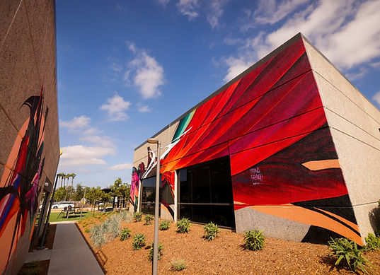
I hired and directed Savage Bureau, from RFP through project completion, to lead brand identity and video. Through the discovery process with Savage, the theme of connectivity emerged — indoor-outdoor connection, a central amenities hub, and the tight-knit community surrounding the campus. I directed my internal team on signage concepts and leasing collateral, partnered with FPBA Architects to translate that message into a placemaking environment at the heart of the property, and commissioned local muralists to bring artwork to the site.
The Outcome:
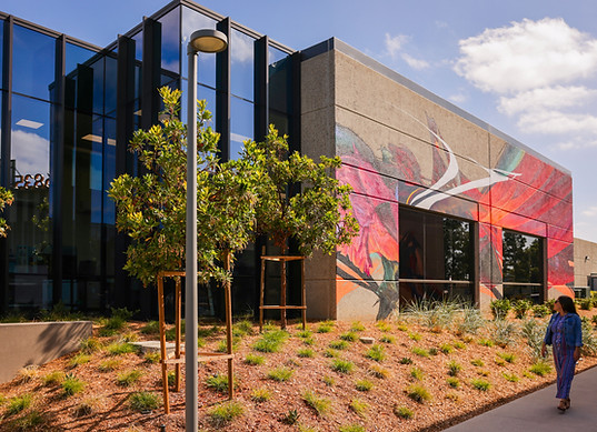
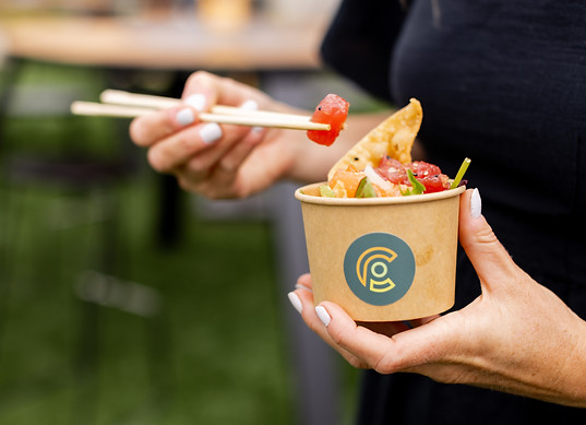
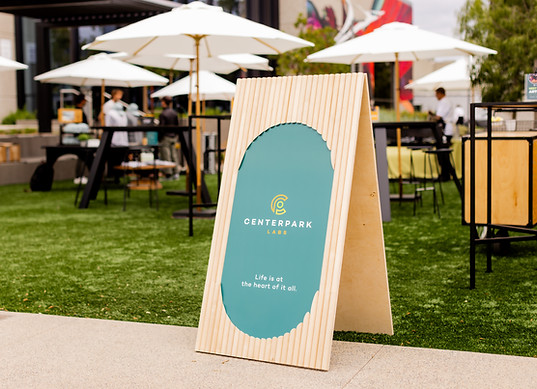
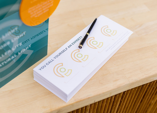
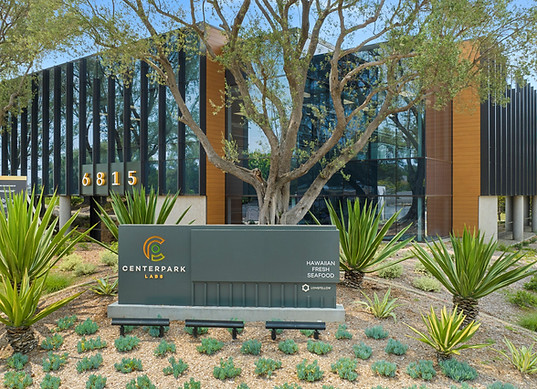
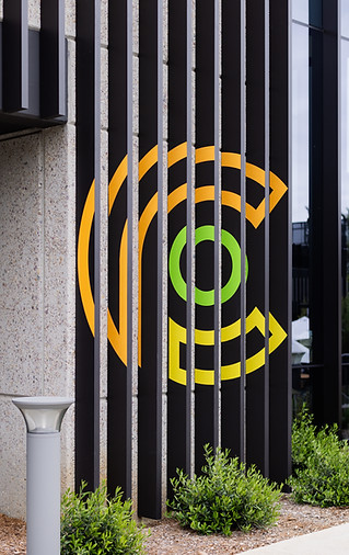
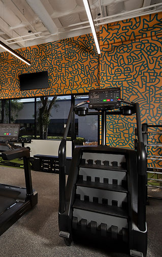
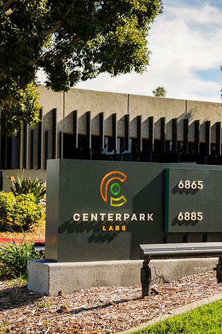
Savage built the logo from the letters C and P, forming a connectivity motif with a hidden easter egg — a person's profile — nodding to the brand's human-centric core. Working with FPBA on furniture and finishes, we chose a broader, complementary color palette to create a less corporate environment where tenants could unwind. One conference room conceals a door within its wood-paneled wall, earning it the name "The Speakeasy." Murals were commissioned from local artists, reflecting how central the surrounding community is to the campus. Because the nine buildings span multiple streets, the logo's color palette was applied across buildings to make wayfinding easier throughout the site. At delivery, I orchestrated a broker event to launch the property.

_edited.jpg)


.jpg)
.jpg)